I’ve charted the Dow Jones Industrial Average (btw, it just changed its ticker to $DJI from $INDU) the past few weekends, so I’m switching it up today to chart the NASDAQ Composite ($COMPX). This is a three year weekly chart.
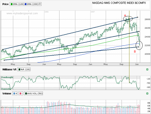
I marked the top circle as “A”. I thought it was interesting to see that was the point that the trend line of higher highs was broken, just before the collapse started. That’s not uncommon, just at the point where fear subsides is when we should worry.
From that same circle you can follow the vertical line I drew all the way down to the Williams %R indicator at the bottom. It hits the point where %R said the NASDAQ was leaving the overbought category. Remember exits from the gray areas are more important than entries with %R.
The NASDAQ hit a speed bump when it passed through the 100 week moving average. That didn’t last long and it immediately came all the way down to and through the 200 day moving average (circle B) before rallying some to close this past week decently above it.
One thing the current price range has going for it is that it didn’t close below the moving average and the longer term trend from three years ago is just below that level. I’m not so bold as to call this a bottom, but with p/e ratios for the broader indices getting relatively cheap, I’m starting to think the risk reward divide might be leaning towards reward having better chances of winning.
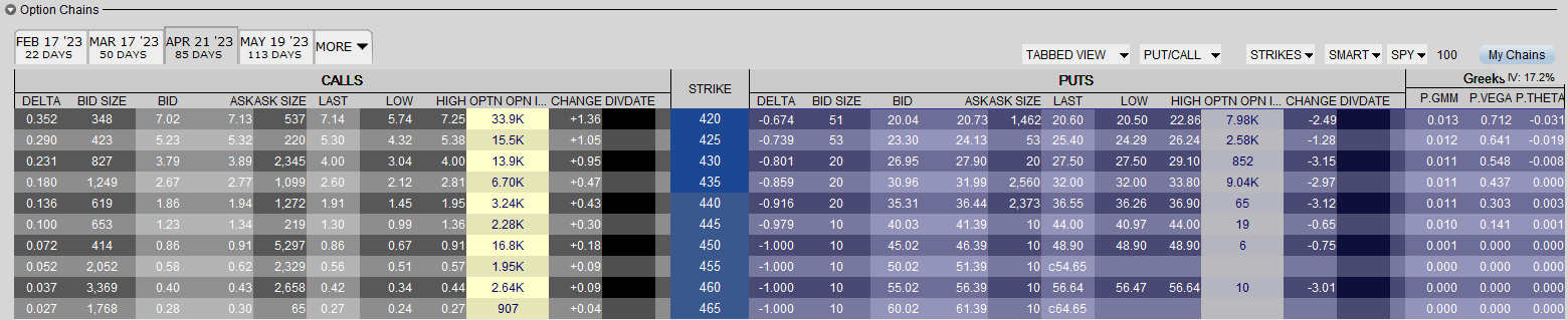
Before charting the NAZ, I looked at Under Armour (UA) and Apple (APPL). They are both beaten up pretty good right now. They could keep going down, but I’m starting to think they won’t go much further. To profit from this theory, I entered limit orders to sell new naked puts on both. Both strikes are well out of the money and my limits are set to hit when (probably should say if) each stock falls a little more. They both bounced off their lows earlier in the week, but I could see them coming back down again. That’s why my limits are at strikes below those lows. Also, both are for March where I need to start building my new pile of options to expire. I’ve already overbooked February options.
Nice post here. I have a couple of friends who drew similar charts and agree with your theory that we may have found a support line in the charts. I guess we will need to keep an eye on the support over next week. I think that things may remain relatively flat, but a slight up-trend could be in the making if you are correct.
http://www.thenetfool.com
Jim, I hope so, thanks for the link too.
I am slowly learning something about this technical analysis business. I’ve noticed that the SSE Composite is doing lower highs and higher lows (Shanghai composite nailed over the weekend). Maybe you can do a chart on it (000001.SS) and teach me something:)
That ticker didn’t work for me in TD Ameritrade’s (AMTD) site. I’ll try to find what you are asking for and chart it for you later this week. I found it on Yahoo! Finance, so it’s just a matter of figuring out what AMTD uses. Odd it’s not the same.
I’m just starting to get into the Technical analysis so reading some blogs that discuss this is helpful! Thanks.
Where did you make that chart?
I make all my charts using TD Ameritrade and then I add text using MS Paint. I automate the moving avgs through AMTD and draw the trend lines myself.
That seems like a lot of work to make the charts then. There’s gotta be a better way (more automated) to plot stuff like that.
It’s actually easy for my day to day stuff. It’s moving it to the blog that makes it more of a hassle. I can fly through a chart in under a minute since the moving averages are automatic and I’ve gotten quick with trend lines over the years. The paint part is just for when I move it to the blog.
I’ve seen a lot of other bloggers use stockcharts.com. I just like AMTD since I spend my time there trading anyway.