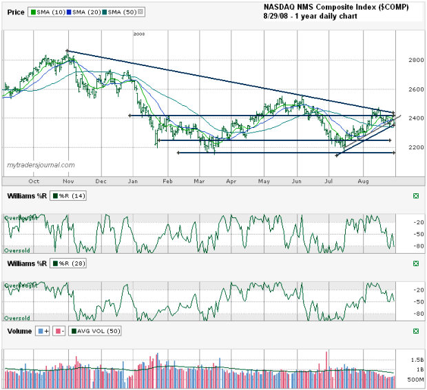
I charted the NASDAQ NMS Composite Index ($COMP) for the past year’s daily price action ending August 29th, 2008. At a glance this chart could look like it’s leaning bullish, but when you zero in on some details that bull might not be a good buy.
- At a glance you could see that the Naz broke the downward trend line of lower highs, but when you look closer you see that break was only intraday and could not have a repeat close higher.
- At a glance you could see a nice uptrend of higher lows started in July, but when you look closer you see that trend already broke when it hit that line slightly above 2400 that has come into play more than a few times this year.
- At a glance you can see that the $COMP is above its 50 day moving average, but when you look closer you see that it used the 10 and 20 day moving average as a ceiling on Friday. To add insult to injury, that’s also the point of a bearish cross over. That’s quite a bearish indicator, when the 10 day moves below the 20 day moving average.
I’ve reduced my holdings through attrition as the options’ cycles roll over and have a decent amount of cash on the sidelines. I’d like to get in deeper, but I think we will see another good dip (or five) before it’s truly time to get in with both feet. Trading in this market can lead to forced trades which cost you in the end. At the same time, I’m watching and if I see a good buy I’ll jump on it.
Michael Santoli made an interesting observation in this weekend’s Barron’s:
Daily moves in the S&P 500 of 1% or more have come, on average, twice a week in 2008, up from every four days in 2007 and once every nine days in 2006. Daily index changes of 2% or more in either direction – seen only twice over a three-year stretch ending in late 2006 – have occurred six times since early July.
That’s a lot of uncertainty to be left in the market for the VIX to be around 20, making this a tough spot to buy or sell options.

