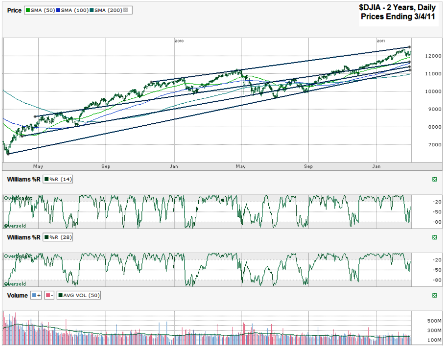
I charted daily prices for the past year on the Dow Jones Industrial Average ($DJIA, $INDU, $DJI) after it closed on Friday, March 4, 2011 at 12,169.88.
It’s been two years to the day (I’m writing this on Sunday) since the market bottomed in 2009 so I decided to take a look at the full bull market we’ve lived through to try to get some hints about what might come next. When I wrote my weekly index chart post for March 6th, 2009 I said to expect a rally soon, but wasn’t ready to really turn into a bull until I saw the charts give the green light. Just a few days later the lights were flashing and I decided to post before the weekend because the chart was so glaringly obvious that it was time to turn bullish, so I wrote Williams %R Indicator Says to Buy S&P 500. I was smart/lucky enough to turn bullish then, but didn’t think we stood a chance of doubling over the next two years like we have so I didn’t put enough at risk for long enough to enjoy the full ride. Now that we’re here, what can we see that might give us a hint about what’s to come?
Recently I’ve been yapping about the bearish crossover with the 10 day moving average (dma) moving south of the 20 dma. It has happened with the $SPX and the $DJIA and I still think it means more days lower in the near term. Since this chart pulls back for a two year view I removed the 10 and 20 dma lines because they were too small to see. Instead I’m looking at where support could come from. I drew three long trend lines that all are possible areas of support. The first was resistance, then support, then resistance again and a few months ago had a few days back in play again. It’s running close to the 100 dma which could help its chances of holding support. The next line down has broken fewer times and has never played the roll of resistance. The bottom line shows the complete trend line of higher lows since March 6, 2009 without one break below it. This is the key line to watch to me. It’s slightly above the 200 dma which I expect to play its roll at some point again this year. Maybe the most interesting part of these three lines is that they are all on a course to converge within a few months. The trick will be to see if they are still relevant when that day comes.
The Williams %R indicator is still down from the overbought range, but hasn’t fallen all of the way down to oversold yet. If it doesn’t make a dip lower very soon it could be a reason to start buying this market again. You can see going back to the fourth quarter of 2009 that we saw multiple %R breaks that took the 28 day indicator about half way down and each time it stopped falling we recovered quickly after only a mild dip.
With the trend line of higher highs still fairly close to Friday’s closing levels it appears there is more downside risk than upside potential from here. Until the 50 dma breaks we could move sideways a little longer. Once it breaks, watch these hurdles I listed above as key areas. I don’t think we’ll fall from the 2/18/11 intraday high any more than 10% at the most and probably not that far yet. I don’t think this potential correction we’re facing is going to be a call to sell, but more of a call to buy at better entry points.

