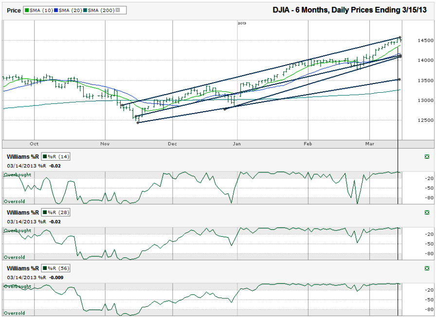
I charted the daily prices for the past six months on the Dow Jones Industrial Average ($DJIA, $INDU, $DJI, the Dow) after the index closed at 14,514.11 on Friday, March 15, 2013.
The second indicator that is the distance the Dow Jones has moved from its 200-day moving average (dma). The Dow is getting overextended at nearly 10% higher than this long-term moving average. Like the previous indicator, this is not a guarantee of a big sell-off in the making, but it does limit the likelihood of a huge move higher. At a minimum, the DJIA should flatten out and maybe will ease off slightly to allow the 200-dma time to move to within 5% apart.Three specific indicators jumped out to me on the Dow Jones chart this week. The first was the trend line of higher highs. This is where resistance has been found each time the index moved higher. It can skim higher as the trend line ascends, but traders shouldn’t expect a surge higher from this line.
Lastly, the Williams %R indicator came extremely close to hitting 0.00 on the overbought limit on its 14, 28 and 56 day indicators, at -0.02, -0.02 and -0.009 respectfully. Actually registering a 0.00 would be a more reliable measure, but such an extreme mark for the technical indicator is enough to raise more red flags, especially when coupled with the other red flags.
The bulls can point to the 10-dma and 20-dma to show they are still in a bullish pattern. The 10-dma is very close to the current Dow Jones level and will be tested soon. A retest of the 20-dma might be all the index needs to reset again as it will be closer to two trend lines of higher lows around that time. Either way a chartist slices it, the Dow Jones chart is showing a path or least resistance that doesn’t move higher by much, if any.

