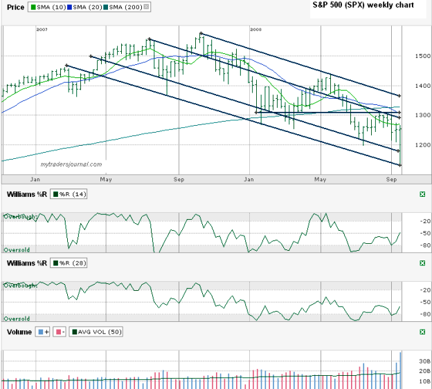
Today I’m coming back to the S&P 500 ($SPX.X) to chart the past couple of years’ weekly price action. I went with the weekly chart this weekend because I thought it was important to take a longer view and remove some of the “noise” of the intraday moves. I see a few interesting markers on this chart.
- The first important point to note in this chart is the past two weeks’ volume. Volume has been way up above the moving average and as many might not realize with the scare during each of the past two weeks, both weeks were up weeks for the index.
- As drastic as the fall was mid-week this week, the SPX only fell to the bottom of its trading range and then found support, keeping it within its trading channel. I wish I had noticed that at the time on Thursday. Maybe I’d have found the guts to buy a call on the index.
- Speaking of the trading channel, it’s still heading down. Don’t be shocked if the SPX breaks above the 10 week moving average and even above the 20 week, but don’t hold your breathe for that upper line I drew to break. That upper line is the trend line of lower highs that peaked nearly one year ago.
- All trend lines I drew were aiming down, except for the flat line around 1312 that is the point of previous lows and highs and could act as a ceiling once again.
- The 14 and 28 week Williams %R indicators are both still moving up, farther away from oversold. Their significance is waning as they both draw near the mid-point.

