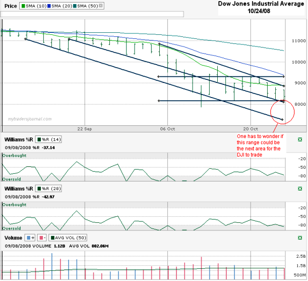
Today I charted the Dow Jones Industrial Average daily price movement for the past couple of months. In red I circled what could be the bearish view of where the Dow could move next. It follows the lower trend line of lower lows and might have a good case for dropping further depending on which analyst you listen to.
The argument against a steeper fall in the near term comes from the two horizontal lines I drew. Those lines show the sideways trading channel the DJI has been in for the past couple of weeks for the most part. The 10 day moving average gives resistance to the top side, but it hasn’t been too strong of an indicator lately. The 20 day moving average hasn’t even been tested in weeks since it acted as a ceiling for nearly two weeks in the first half of this chart. The Dow is so far below the 50 day moving average that one might have to think a reversion to the norm is possible, pulling the Dow north again.
That’s a lot of mixed messages from one chart and helps explain the insanity we are seeing daily in the markets. How odd is it that Friday was a 300+ down day and most people considered it a yawner? We fell for the week, but without high volume. Had we thrown big volume into the mix, we might be in a place to call a bottom, but that day might not be here yet. Personally, I’d like to see another bounce back up to above Dow 9,000 so I could sell more calls and buy some new puts for the ride back down. If we do move higher I can’t imagine that it would be sustained for long and that we won’t have new buying opportunities a few (dozen) times again.

