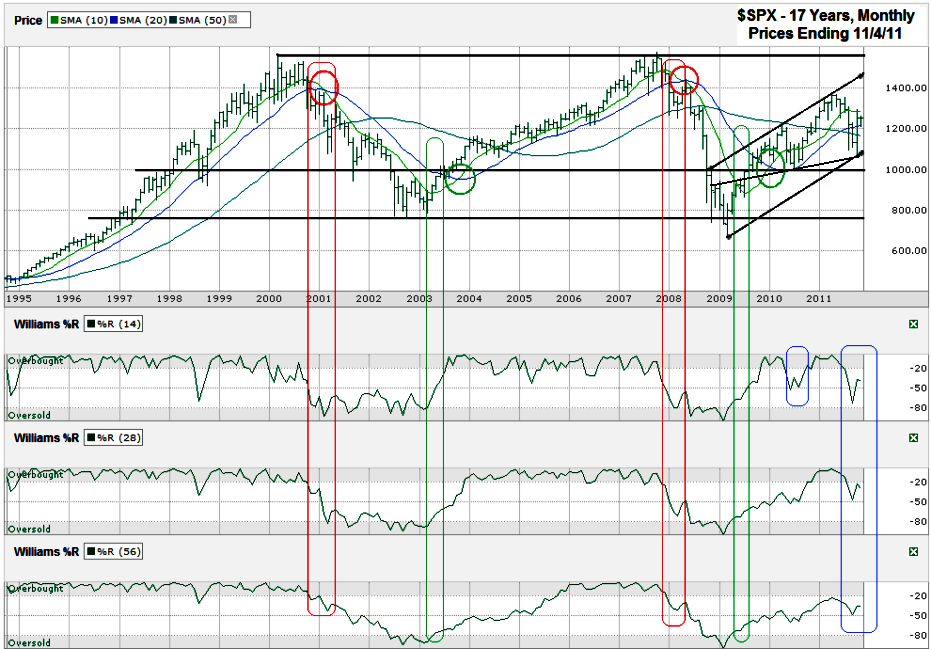
This S&P 500 ($SPX) chart shows the past 17 years of monthly prices after the index finished the week higher at 1,253.23 on Friday, November 4, 2011.
Charts are not only telling when viewed over short periods, but also over longer periods. Investors can use shorter charts to maximize gains and reduce losses week to week, but need to keep an eye on multi-year charts to smooth out intraday volatility and adjust risk accordingly.
In this chart, the 10 and 20 month moving averages (mma) tell the biggest story along with the Williams %R indicator. The red circles show each time the 10 mma crossed below the 20 mma and triggered a sell signal. The green circles show when the 10 mma moves back ahead of the 20 mma and triggers a buy signal. An investor who only paid attention to this single indicator would’ve saved a lot of money by withdrawing risk during the sell cycles.
However, using only one technical indicator can be dangerous. By adding in the Williams %R indicator a chart watcher would’ve had earlier signals to prepare for the bigger change in sentiment. The longer red loops show the area where Williams %R began to crack in the 14 month period and followed through all of the way to the 28 and 56 month periods. This has only happened twice in the past 17 years and both times were at the beginning of massive sell offs. The green loops show where it was safer to re-enter the market. The blue loops show where Williams %R has been less exact since the 2009 recovery. In 2010 only the 14 month indicator issued a sell signal. The 28 and 56 month signals had not reached overbought yet and their gyrations did not trigger any alarms. In 2011 the 14 and 28 month indicators issued sell signals, but the 56 month indicator never reached overbought and remained neutral. All three need to work in unison for a major market cycle to be in place. That is still not the case.
The trend lines work over longer periods also, just like they do on daily charts. The $SPX is still within its recent ascending trading channel, even when viewed with two different trend lines of higher lows. The index is also in the middle of its horizontal support and resistance lines which leaves nearly equal room for upside and downside movement.
When adding these indicators together, the probability leans to the bulls’ side. The trend lines are somewhat neutral, but the edge goes to the ascending trend line. The moving averages still show a bullish cycle is under way, but teetering with the $SPX below the 10 mma. Watching support from the 20 mma and 50 mma could give early insight if another larger correction is starting. Williams %R gave the warning of a short correction, but without the 56 month indicator being included the chances of another major sell off are limited. This is not an easy market to watch daily, but the signs are there to remind patient investors to keep an eye on the long term before making short term decisions.


