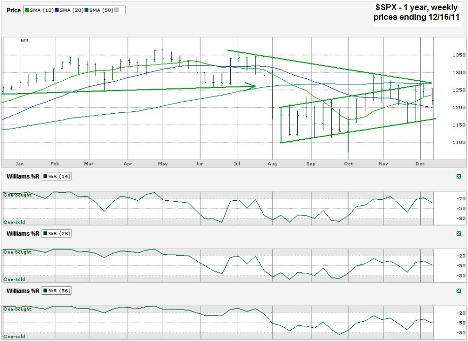
This S&P 500 ($SPX) chart shows the past twelve months of weekly prices after the index finished the week at 1,219.66 on Friday, December 16, 2011.
The technical indicators aren’t all in agreement this week which makes traders more skittish going into the lower volume last two weeks of the year. When the picture isn’t as clear traders tend to sell or at least not buy. At some point the price action will change and one side will have a clearer picture to work from and that’s the time to trade. This might be a better time to stick with a wait and see approach, but while ready to make a move in either direction quickly.
The trend lines show severe resistance just above the 1250 area. One trend line of lower highs has been the major ceiling for the past two months and continues to fall and hold stocks back. Another line (that I had to stop drawing all of the way through because it blocked other lines) was support until the end of the summer, but is now acting as resistance too and adds to the size of the hurdle the bulls have to get over. The other two trend lines go together and form the trading channel since the market first sold off in August. It shows the trading range with a few exceptions and puts the current $SPX level almost at the midpoint of upside potential and downside risk.
That leaves the moving averages and Williams %R for this chart. The moving averages show a very bullish 10/20 week moving average crossover that started three weeks ago. Since then the index hasn’t followed through on the technical event that usually indicates the beginning of a strong rally. However, the same fake came to the downside in July when the reverse crossover occurred and the 10 week moving average moved below the 20 week moving average. The 10/20 indicator worked then and leads me to believe the bulls still have a good fight left in them. Williams %R isn’t crystal clear since the 28 and 56 week indicators never made it to overbought. The 14 week indicator did nudge into the overbought area barely and then faltered. For now, I’m taking it with a grain of salt, but still include it as an indicator that shows all arrows do not point higher yet. It also reminds me that any new push into higher territory might not last too long and could be sold after taking some profits at a higher point.
There’s always the Santa Claus rally that often kicks in during the last week of the year. That might be the biggest hope for the bulls while the chart’s technical indicators play battle for which one is stronger this time around.


