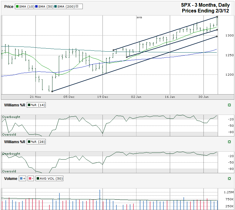
This S&P 500 ($SPX) chart shows the past three months of daily prices after the index finished the week at 1,344.90 on Friday, February 3, 2012.
Three trend lines stand out in this chart. All are ascending. The lowest line traces the trend of higher lows that started in November. The top line tracks the trend of higher highs and the middle line follows the trend of higher lows, but only since late December. The top two trend lines create the boundaries of the trading channel that the SPX has been trading within for a month and a half. Each touch of the upper trend line (as seen on Friday) results in a flat to lower market for the following few days until the lower trend line catches up to offer support. This trading channel will break apart at some point and the cracks tend to come to the downside, especially after such a long run within a narrow path. That is when the lowest trend line will be tested again. This line is not much lower, but would give the index a much needed rest period to consolidate its gains. A fall below this trend line could foreshadow much bigger losses to come before another area of support is identified by traders.
While the trend lines battle out support and resistance, the moving averages have their predictions to make. The large cap index is trading above all of its moving averages from as short as 5 days to 200 days. This is a bullish sign in itself, but always comes to an end eventually. The first key moving average to watch is the 10 day moving average (dma). The SPX has not had a full day trading below the 10 dma since mid-December, when the last mini-correction bottomed out. This past week saw multiple intraday crosses of the line which in itself is a red flag for bulls. Early in the week the S&P closed on the moving average one day and beneath it the next day. If the following day would’ve been a confirmation day lower, chartists would have expected a much bigger sell-off to ensue. Instead it recovered and kept the bears off the playing field a little longer.
Traders will quickly shift their attention to the nearest area of potential support once the 10 dma breaks. This will result in a sudden drop in stock prices until the index reaches its target. That target could be the 50 dma which just had a bullish crossover above the 200 dma. Moving average crossovers that see a shorter time frame move above a longer time frame tend to signal better days ahead. Unlike trading channels marked by trend lines, rallies defined by moving averages do not move in such straight paths. A retest of the 50 dma would be considered healthy before the next leg of the bull market took place. If traders see support work at the 50 dma they will pull money off the sidelines and into stocks very quickly and investors will be in store for another long run higher.
As with the trend lines and moving averages, the Williams %R indicator is not giving a sell signal yet, but does show a reason to suspect a period of consolidation is due. As long as the indicator is in the gray overbought area then the rally still has momentum on its side. Investors can expect further declines to follow once the indicator moves below -20 for at least two days in both the 14 and 28 day periods. When the indicator climbs above the -1.0 area as it did on Friday, the next few days tend to be flat to lower. In other words, Williams %R is in agreement with the trend lines. While the future has promise, the next few days are not the time to buy into it. While an active trader might risk shorting the index now, an investor with a longer time horizon would be wise to wait for a clearer bearish signal before taking profits.


