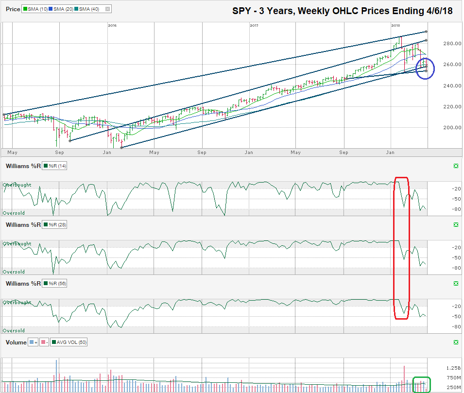
The chart below shows the weekly prices for the past three years on SPY, the SPDR ETF that tracks the S&P 500 Index, after closing the week at $259.72 on April 6, 2018.
One of the best methods to remove the “noise” of near-term volatility is to stretch a chart to multiple years and switch the bars to weekly instead of daily. By looking at a longer timeline, a chart technician can see if the long-term trend is still intact. I drew four trendlines that cover the past three years on this chart. The top trend line shows the absolute points of higher highs. The next trend line shows the trend line that starts with a point of support that became resistance with exceptions in January 2018. The bottom trend line marks the trend of higher lows that began in the winter of 2016 and held support until last week. The shortest trend line covers approximately seven months, including the February low and the low from this past week.
This short line has become the crucial line of support (circled in blue) for the large-cap index. After breaking below every moving average from the 10-day to the 50-week moving average, SPY needs to find buyers above this short trend line to keep the sell-off from gaining more momentum. If the $255 range doesn’t find buyers, the next stop could be closer to $240 where SPY found support last summer and then as low as $220, an area of temporary support in December 2016. Falling to $220 would mean SPY was in bear market territory, down 23% from its high, and would have given back more than 50% of its gains since its January 2016 low.
After SPY hit an intraday high of $286.58 on January 26, it fell 11.13% to $254.68 on April 2 and finished the week at $259.72, 9.37% off its high. Many technicians viewed this retest of the February low as a mandatory step before stocks could resume the rally that has run for more than nine years so far. Without this double dip, stocks would’ve recovered too quickly and not shaken out those investors with less conviction. While a correction (a 10% decline) feels like the wheels have come off the bus, the reality is that outside of 2017, these moves are a normal part of the market cycle.
The Williams %R indicator predicted the weakness in stocks in January when it fell below the overbought range (highlight in red), but stocks didn’t follow through on the initial weakness. This consolidation period over the past couple of months has left the Williams %R indicator in a state of limbo. The sell signal was obvious, but until the indicator reaches the oversold range and bounces, the buy signal will be harder to call, at least on a weekly chart.
In the bottom right corner of this chart, I circled the weekly volume in green to highlight how few shares traded hands in the first week of the second quarter. This drop off in volume (the lightest week in more than three years) shows the price declines hit the indexes with little conviction. Fewer sellers are can make a bigger difference when volume is low. The losses are real for now, but often not sustained in the weeks that follow. In other words, don’t panic over a price decline that has few sellers driving it.


