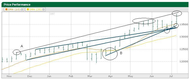
I drew a few lines on this week’s Dow $INDU) chart. The top line (A) is drawn with a thinner line just to stand out more. It started back in November 2006 and acted as a ceiling in May 2007. We finished the week almost on it and this week will be a good test to see if we continue our incredible momentum from the past week or if we’ll take a break and head back to line B which crossed the previous two trend lines I’ve been talking about the past couple of months. Those two middle lines merged like I said two weeks ago and the Dow liked that extra support and shot up from the intersection.
I’m not sure when those two lines will come back into play, if they ever do. That’s why I didn’t label them. I’m not focused on them for now. Back to the line we saw start in March 2007 (Line B) and again acted as support in June and again last week. To me that’s going to be the line to watch to the downside for the near term. Lines A and B could be our trading channel for the next few weeks until they start getting closer to merging.
Click the thumbnail below for a full chart.
Technorati Tags: Stock Charts, investing, stocks, Dow Jones, Index Charts, $INDU